Friday, 28 December 2012

How To Go Bold With Your Wall Color

Looking for a bold wall color for your living room, dining room, or bedroom, but not sure where to start?  Wondering which wall color you really want?  Afraid of making a huge mistake?  Don’t worry.  It’s easy to make the look you want, as long as you remember some of the basics.

Basic #1:  Let Your “Statement” Piece of Furniture Be Your Guide
Your “statement” piece might be a family heirloom, something you found at an antique store, the newest release from your favorite furniture store, or a creation of your own!  Whatever it is, think about why you like that piece of furniture most.  Ask yourself what really makes it stand out. 
If it’s the shape, than you can pretty much pick any wall color you like.  But if it’s a bright color (like the red color on this dresser), don’t paint your wall the same color!  Paint it something complementary, like brown or a light gold.  You can also (as shown here) pick out the accent color of your piece.  The accent color on this piece is gold, and blue is its complement!  See how this wall color makes this dresser look rich and inviting?


Basic #2:  Bold Doesn’t Have to Mean Bright
If you pick a softer color, like this aquamarine blue, your wall color can still stand out beautifully.  Even the simplest wall color can look amazing if you choose the right accessories and furniture to go with it. 


For this look, choose lustrous, bright accessories and peaceful, neutral colors for your furniture and bedding.  Metallic and neutral colors bring out the brightness of the softer aquamarine without overshadowing it.  Talk about a great supporting cast!

Basic #3:  Less is Always More
Keep your color palette nice and clean!  Pick just one or two accent colors and keep to them!  As you can see here, a bright wall color is best paired with neutral accent colors that help show off its beauty.  The accessories are spare, but well chosen, and there’s no clutter on the floor. 
This look works best for someone who wants to transform their living room or dining room into a tranquil space where they can escape from the stresses of daily life and re-energize themselves.


And, of course, always remember to pick colors that you really like!  You’ll be looking at them all day, so pick colors that make you feel like you.  

Wednesday, 12 December 2012

A Little Trim Paint can make a Huge Difference

Houston boasts countless older, beautiful homes, town homes, and apartments that may present buyers with unique problems when it comes to trim painting. While many people shy away from attempting this arduous task, it can actually be quite fun and rewarding. Well applied trim paint can completely transform the atmosphere and energy of any room.

Many older apartment have large baseboards, wainscoting that has been neglected for years, and crown molding that has definitely seen better days. Carefully applied trim paint can brighten a room, especially if paired with a soft and subtle wall paint like the blue in the photo below. Notice how this home owner has taken advantage of the gorgeous dark wooden floors by painting all the trim a clean white. The retro chandelier truly makes the colors glow. Who wouldn't want to soak in that tub?


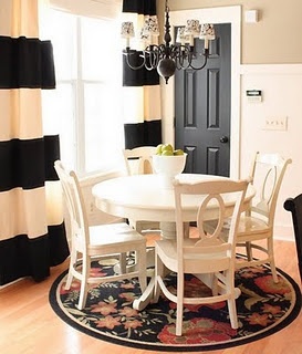
Many dining room areas are quite small in Houston homes, if they are even present at all. Below, a single door has been entirely painted black and paired with white trim paint and wainscoting, and modern curtains with bold black and white stripes. The room presents a visual feast for both diner and guest. Choosing to paint an entire door black can be risky, but this home owner has pulled it off by accessorizing the little dining room with a chandelier, a unique circular floor rug, and curtains that all complement the door.


A less common approach to trim painting, as demonstrated by the photo below, is to solely paint the window trim in a single room a dark, uniform color. This strategy works particularly well in home with very high ceilings. The elongated window, now trimmed in black, makes the walls and ceiling appear even larger than they are. If you are trimming a very small window in black, you run the risk of creating a "porthole" effect. You also run the risk of spoiling your cat's window time with paint that absorbs too much heat.


In our final trim paint example, we've found a home owner that goes above and beyond when it comes to capitalizing on the special characteristics of a particular room. The curvy and wide entrance way below has had its underbelly painted white to remain aesthetically consistent when the ceiling gazer decides to take a closer look. The teal toned walls pop and look fresh jutting up next to the thick, white-trimmed door frame, baseboards, and patterned ceiling. If you have any stories to share with us regarding your own trim painting project, feel free to leave a comment. We would love to hear back from you.


Thursday, 6 December 2012


Grey:  The Elegant Neutral


If you’re looking for wall color that’s new, but easy to incorporate with any season’s décor, try grey.  Unlike beige or cream, grey is a rich neutral that provides balance and elegance to any room.  Use it as your interior color palette for a dining room or guest bathroom and you’ll find that it looks good in any season.

Let’s go from light grey to dark grey.  Light grey can brighten up with a room and goes well with modern furniture. 


If you hire a HoustonCommercial Painting company, it will be easier to vary your interior color palette.  You can have the Houston Painting Company use two or three shades of grey to provide depth for your living space.  Going with a slightly darker shade of grey can make spaces that are small seem larger and more inviting. 


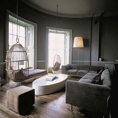
For added elegance, go for a grey that’s almost black, but paint only one wall.  Choose the shade closely—tell your HoustonPainting Contractor if you think it might be too dark.  Use light, airy colors and metal accents for the rest of the room so that your interior color palette will be calm and well-balanced. 


Friday, 9 November 2012

Creating the Ideal Palette: Part 4

In the fourth and final installment of our "Creating the Ideal Palette"' series, we analyze the psychological properties of Black, White, and Grey - colors you may consider for any interior or exterior painting projects for your home or business. The tone of a room can be dramatically impacted by something as simple as wall color choice. Below, we present the final three colors.  


BLACK

Paint it Black! Black, a serious and somber color, doesn't always have to be about doom and gloom. It can also represent elegance and sophistication. While black threads can help make you look mysterious and...thinner, hints of black in a room's decor can add subtle beauty, making it visually engaging. Black is used best in modern spaces and works well when combined with white and grey tones. 


WHITE

White, the combination of all colors from the color spectrum, is refreshingly clean and fresh. White is perfect for creative spaces, and especially creative spaces for the little ones, because it evokes spirituality and peace. The kids may still make a mess, but at least you can cool off in a soothing atmosphere.  

GREY

Grey can be a tricky color to work with, but that certainly shouldn't dissuade you from trying. Because grey is neither here nor there, it can often seem flat; the room may feel like it lacks energy.  Grey can, however, be used effectively to make smaller spaces feel larger, an issue we discuss on our latest blog, "Grey: The Elegant Neutral". We'd love to hear your opinion on the matter!

Friday, 2 November 2012

Creating the Ideal Palette: Part 3


When it comes to choosing the perfect color palette for your home or business's exterior or interior, the vast array of possibilities can be intimidating. In Part 3 of our "Creating the Ideal Palette" series, we're tackling the color psychology of Purple and Brown. If you read Part 1 and Part 2 of the series you already know that color psychology is the study of colors and how they affect human behavior. 


PURPLE

Purple, the traditional color of royalty, is associated with wealth, prosperity, and sophistication. When combined with blue and red, some shades of this regal color have more of a calming property, while other shades have a more sensual appeal.

Use the color purple in rooms where you wish to spark creativity and spirituality. 

BROWN

Brown is associated with reliability, comfort, and friendship. It can be used effectively in work spaces to cultivate stillness and encourage the peace of mind of a writer or artist. Lighter shades of brown go conveniently well with boldly colored furniture and accessories. 

Friday, 26 October 2012

Creating the Ideal Palette: Part 2

Part 2 of our "Creating the Ideal Palette" leaves the Red, Pink, and Orange of our first post ( Check out post #1), and explores the possibilities of Yellow, Green, and Blue.  Color Psychology, the study of colors and how they affect human behavior, is important to keep in mind when planning to paint your Houston residence or commercial business. Below, we break down the three color stars of this week's post.

YELLOW

Yellow is a happy, cheerful, and enriching color. Commonly associated with laughter, yellow releases serotonin, a ‘feel good’ chemical in our brains. Like orange, yellow's optimism helps boost creativity and intellect.

Spaces painted with yellow encourage people to be more extroverted and talkative. Shading, however, is a little tricky with this color, as some shades are popularly associated with cowardice. A too-bright-yellow is not recommended around babies. A more gold-toned yellow is ideal.

GREEN

This is the color of hope, growth, and the inspiring natural world, associated with healing and relaxation because of its restful effect on the eye. Green can be a very inspiring and positive color, but like yellow. working in shades can be tricky. If you use bluish tones, you may risk coming off as boring.

This color is recommended for: work spaces, outdoor spaces, and rooms purely meant for relaxation at home.

BLUE

The color blue induces the release of calming chemicals in our bodies. It also symbolizes trust, spirituality, wisdom, and clarity. Avoid using blue in excess because it can induce melancholia and feelings of loneliness.
Lighter shades of blue are excellent for bedroom spaces.

You may also use this color for sports-related spaces because it enhances athletes' performance. 

Wednesday, 10 October 2012

Creating the Ideal Palette: Part 1

The color  you choose for the interior and/or exterior of your home or business sets the mood and can have a psychological effect on your friends, family, and customers. As you begin painting your Houston residence or commercial business, it's  helpful (and fun!) to familiarize yourself with color palettes and their meanings according to color psychology-the study of colors and how they affect human behavior. 

The art of color psychology gives you the power to send a positive or negative message, calm a crowd, encourage sales, or simply encourage enthusiasm. Each individual color comes with its own connotations and vibes.

Part 1 of our series of posts on color psychology will closely look a a number of different colors, explaining how appropriate each is for your living or work spaces. We'll start with Red, Pink, and Orange.  


RED

Red suggests passion, excitement, and power. It has activating and stimulating properties. Red is also associated with love, richness and luxury, and can be used to signify abundance and prosperity. This may seem strange, but the color red can encourage  a stronger appetite, which is why we see it used so often by major food franchises, like McDonald's and Pizza Hut. And of course, red is the color of seduction. For this reason, it may not be the best choice for work spaces. 

Red can be effectively used for the following spaces: kitchen, dining room, and living room, with more earthy reds reserved for the bedroom. 

PINK

Pink is the color that soothes the mind and symbolizes love and romance. Oddly enough, pink is the wall color of choice for many prisons because it has been shown to reduce aggression and violence in individuals. 

Use pink effectively in the bedroom, keeping in mind that too much pink may make space overly feminine. 


ORANGE

Orange is an incredibly energetic color that is often associated with fun and active lifestyles. It’s sociable, cheerful, optimistic, and creative. Due to its creativity-boosting properties, orange is often used for artistic spaces. And, like red, this fiery color is known to boost the appetite.